
Hi everyone. I hope you are having a wonderful day. Today I would like to share with you 2 cards that I created using 2 of Karen Middleton's portrait images. For anyone who follows my personal blog know's that I also love to color images with my pencils on Kraft paper. Well this is my first time coloring Sweet Pea Stamps images with my Prismacolor pencils and I am sooooo pleased with how they came out.

This first one I used the image called "Pixie" and she can be purchased as a single of on Sheet #18, Plate #194. I used some Six By Six paper by My Minds Eye called "Honey Cake".

I colored her with Prismacolor pencils. I also added some Wild Orchid Crafts roses, pearl wedding embellishments, distressing tool and distressing ink in Stained Walnut.

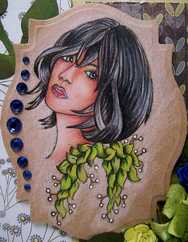
For my second one I used another Karen Middleton stamp called "Tara" and she can be found on the same sheet.

I colored her with Prismacolor pencils on Kraft paper too. I used some Basic Grey paper from the "Marjolaine" line. I added some flowers from Wild Orchid Crafts, Sizzix Leafy Flourish die that I cut into pieces. I also used a Spellbinder Nestie Die for the image and added some blue rhinestones. I also went around the edges of the paper with Distressing ink in Crushed Olive.
Well I hope you like these and that I tried to create something a little different.
Remember there is a HUGE sale going on over at the STORE. SO hurry up and grab some FAB deals before they are gone.
Thanks for stopping by and have a wonderful day.
Hugs:)
Angela
Love those hair colors Angela! Your use of the white accenting is very nice as well.
ReplyDeleteConnie
Your colouring is fantastic, and the cards are beautiful. I was wondering what colors do you use for skin?
ReplyDeleteThese are really wonderful Angela - love your pencil work.
ReplyDeleteBest wishes, Sharon
Ooo, Angela . . . your images are colored soooo beautifully!!! And . . . those eyes are just breathtaking. ~ Rose
ReplyDeleteOh my! These are amazing! If I could do this with colored pencils, I'd never pick up a Copic again. WOW! I'll be at your house soon so you can teach me :)
ReplyDeleteWOW, you must have taken some serious art classes. WOW. You are wonderful. I took art in college, but my prismacolors never looked as awesome as that :)
ReplyDeletegorgeous Angela, I love the look of these. The hair on these ladies are beautifully colored in.
ReplyDeleteWow Angela these are stunning, especially the brown and orange card so beautiful!!xx
ReplyDeleteHi Angela, great colouring with the pencils, also one of my fav techniques! warm greetzx Miranda
ReplyDeletegorgeous coloring! beautiful cards, would love to know what you used for the fleshtones.
ReplyDeleteGorgeous projects, Angela. I already admired them on your blog. Love your pencil colouring as much as I do your Copic creations. I am really amazed about your talent in colouring!
ReplyDeleteHugs, Karina
Here are the colors I use for Flesh on Kraft paper. But first the key to achieving the best out of your pencils on kraft paper is to start coloring the skin very lightly all over with Cream, then go over that with Light Peach lightly. You need to get your base down first so you can start ti achieve the real look of skin and it make the colors of the pencils come out the right color and be bright against the kraft. So I guess what I am saying is start very light and then build you color up from lightest to darkest. You will need to start adding a little bit more pressure with your coloring as you go darker. You will notice that your coloring will start to burnish and that's what you want, it's all about building up colors and highlights.
ReplyDeleteHere are the colors I use light to darkest with my Prisma pencils.
Cream, Light Peach, Peach, Mineral Orange, Light Umber and then for all my shadows I use Henna and Dark Umber and just blend them all with the next color. You may have to go over the darker colors with your next lighter color to blend to give you the effect you want. I also do at time add Black in the darkest corners like I did under the neck on these too. If it's too much then just blend again with a lighter color.
The only Kraft paper I use is the Kraft paper from Hobby Lobby which is made my The Paper Company. I have tried a lot of different Kraft paper and this works the best for me. Unlike when coloring with Copics you want smooth paper, but with Kraft paper and coloring using pencils the rougher the paper the better. It picks up the colors a lot better and lets you build up your colors without looking like a big smeared mess.
I hope this helps, feel free to ask away.
Hugs:)
Angela
Love the krafty look. It sure looks different. Beautiful.
ReplyDeleteThanks Angela, those tips are very helpful. Can't wait to give it a try.
ReplyDelete