
Hi everyone. I hope you're doing fine and enjoy summer.
Today I want to show you the first part of the Sweet Pea Classics series I created. Those are images which are some of my all time favourites. Those are images with which I fell in love from the first sight and still am in love with. And through them I got to know Sweet Pea Stamps a while ago. All those images are by the fabulous artist ching-chou kuik who's whole collection you can find HERE.
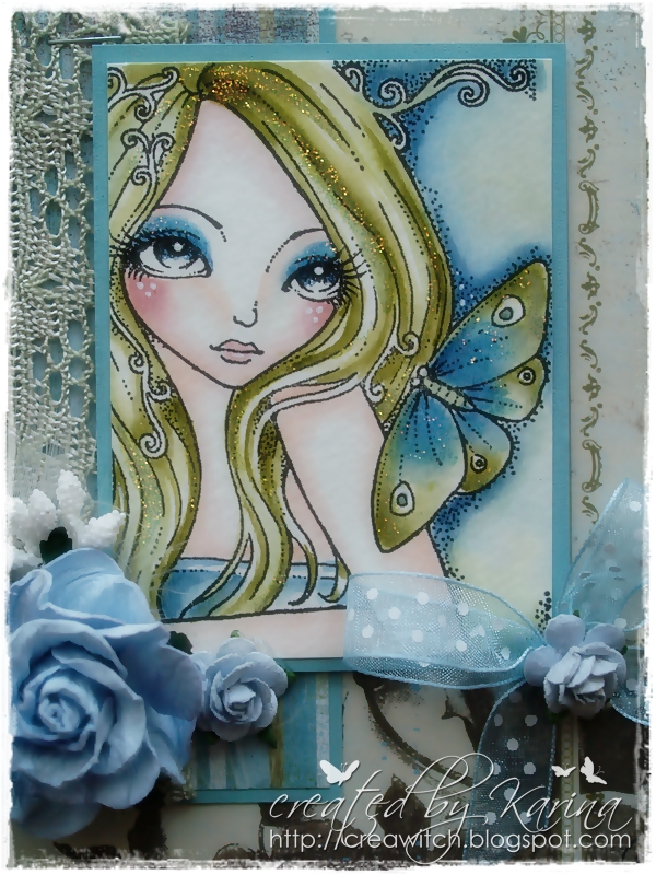
The first one is called 'Come Softly'. I coloured her with Distress Inks on 300 gram watercolour paper. I cannot say what designer papers I used as I had them left from other cards I made.

The second card I show you is made with 'One and Only Heart'. I coloured her as well with my Distress Inks on heavy 300 gram watercolour paper. The designer papers are from Marianne Design.


Well, soon I will show you two more Sweet Pea Classics. So watch out for my Part II who will be follow. Thank you so much for your visit. It is always so much appreciated.
Have a magical day!
Hugs, Karina

hiya sweetie
ReplyDeletethese cards are gorgeous hunni
love the images very much
hugs angelique
Oh wow!! Stunning as always Karina. I adore how you achieve this look with distress inks!
ReplyDeleteI like the soft look you achieved Karina. And I love your color palettes!!
ReplyDeleteConnie
Gorgeous Karina! So delicate and soft looking, they both are fantastic. You coloring is always so pretty
ReplyDeleteWowsers, these cards are simply stunning. I love the softness of the coloring just absolutely beautiful.
ReplyDeleteThose images are some of my all time favourites to, Karina!:). Fabulous cards, Karina and your colouring, as always, is superb!! I love the dp and the soft looking! They all looks amazing!:)
ReplyDeleteHugs, ellen
Wonderful cards Karina, I just love them both. The second one is really gorgeous in pink. I love the embellishments you picked. The lighter coloring is just amazing and makes both images look elegant.
ReplyDeleteOh Karina, I love both of your creations. I so adore your coloring with distressing inks, I know I tell you that all the time but I can look at it forever. It always looks so creamy and wet looking. I really lover the first one and your papers and embellishments always match perfect.
ReplyDeleteHugs:)
Angela
oooh! how beautiful. i looove them. stunning cards!
ReplyDeletehugs!
Beautiful Karina. I really, REALLY love the greens and blues with Come Softly.
ReplyDeleteLove the cards!These are stunning and i really love the soft colors! your coloring is perfection and the embellishments are wonderful! Love these both!
ReplyDeleteyour cards are stunning, love all the gorgeous embellishments, layouts and the coloring never ceases to amaze me.
ReplyDelete